


Print Design | Editorial Design
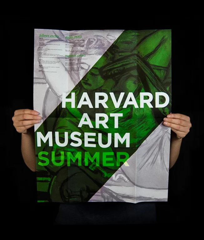
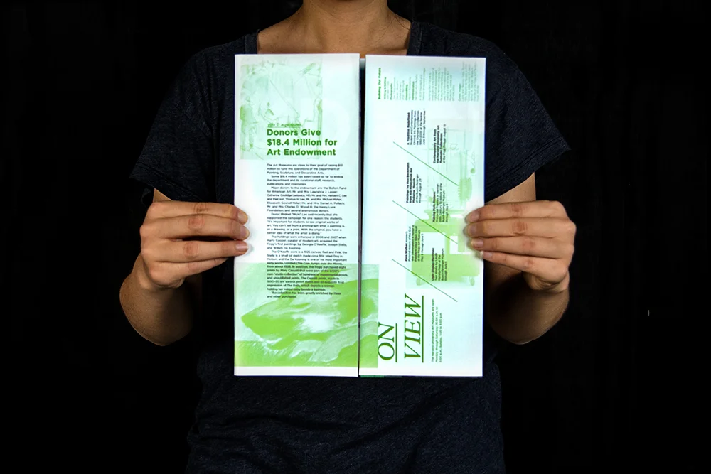
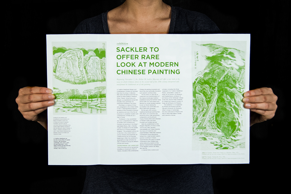
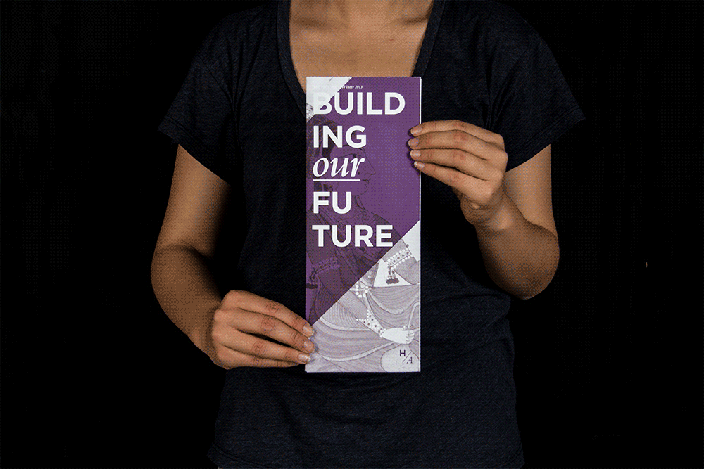
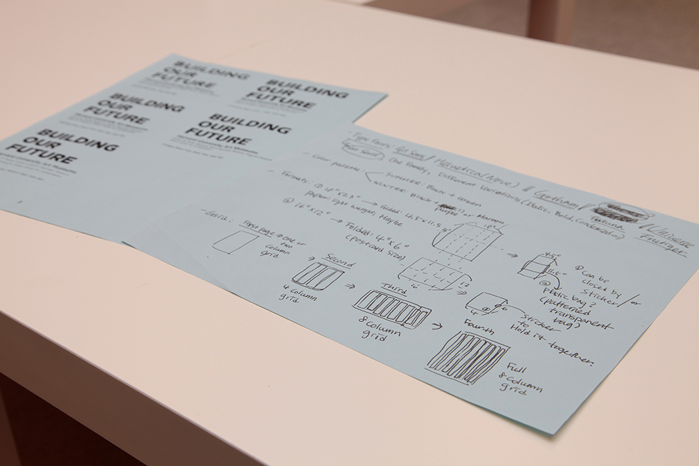
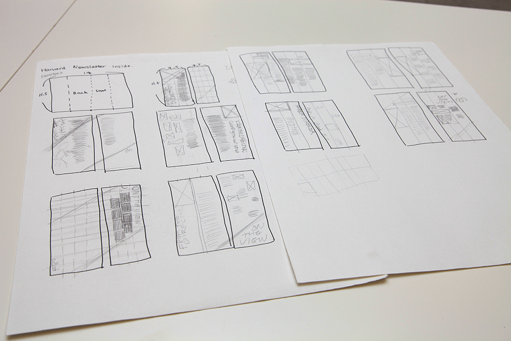
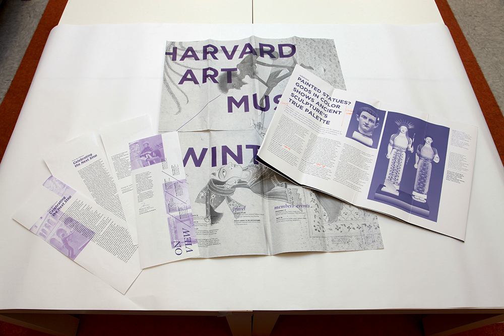
This is a biannual newsletter for special events at Harvard University’s Art Museums. To concept this newsletter, I put myself in the place of the recipient. How could I design a newsletter that wouldn’t just be tossed in the trash can? I decided to create a newsletter for their spring and winter seasons that would deliver the content in a unique way and give a reason not to throw out. I used a folding technique to create a different experience for readers as they unfold the newsletter.
When it's unfolded completely, the newsletter turns into a collectable calendar that doubles as a poster with a feature art of that season (18"x23"). This gives viewers a purpose to collect and display the newsletter each season.
Each newsletter has its own accent color that symbolizes its season: green for the spring/summer newsletter and purple for the fall/winter one.
Design process
The project was developed at the Maryland Institute College of Art under the supervision of Kim Walker, a lead designer at Pentagram.